Content Marketing Analytics: 9 Ways to Use Data To Transform Your Strategy


Content marketing isn’t an exact science. After all, the way people interact with content changes constantly.
However, a deep understanding of content marketing analytics can help you make more informed, even scientific, decisions about your strategy.
If you aren’t already using analytics, you’re behind your peers. Only three percent of bloggers never use analytics. A whopping 29 percent track every single one of their posts.
Even if you are using analytics, you may not be using the right tools or looking at the
Luckily, from the free and comprehensive Google Analytics to paid tools like HubSpot or ClickFunnels, there are dozens of content marketing tools to choose from. Perhaps even more important than the tools, though, is the strategy behind them. How can you use these tools to gain insight that you can then apply to your strategy and campaigns?
In this post, I’ll explain the importance of content marketing analytics and the different ways you can use complicated, detailed analytics to improve your content marketing strategy.
Why Are Content Marketing Analytics Important?
There’s proof using analytics helps your content marketing strategy succeed. In the most recent B2B content marketing survey from the Content Marketing Institute, 90 percent of the respondents who ranked their company’s content marketing efforts as “successful” measure their content’s performance. On the other hand, only 34 percent of respondents who report disappointing content marketing results measure their content’s performance.
As a content marketer, data and analytics should guide your decisions about your content marketing campaigns and strategies.
What does this look like more specifically? Data can answer many questions, including:
- Are my current marketing efforts working?
- What types of content resonate most with my audience?
- What types of content are not relevant to my audience?
- Are there gaps in my current content marketing strategy?
- What pages are most effective at building traffic?
- What pages are most effective at driving conversions?
The answers to these questions should inform your content marketing strategies.
9 Ways to Use Content Marketing Analytics
For beginners and seasoned marketers alike, content marketing analytics can be overwhelming. This is especially true when it comes to applying the insights to real-life campaigns.
SEO. Unlock massive amounts of SEO traffic. Get real results from the SEO experts.
Content marketing. Our team creates epic content that will get shared, get links, and attract traffic.
Paid media. Effective paid strategies with clear ROI and immediate measurable results.
1. Use Bounce Rate to See Which Pages Have the Highest Engagement and Identify Common Themes
According to Contentsquare, the average bounce rate for e-commerce sites is 47 percent. When your pages are above that average, you may consider those “high” bounce rates. The good news is that you can actually use high bounce rates to your advantage. Traffic is going to the page in question, so where are these visitors going?
From the left navigation in Google Analytics, go to Behavior > Site Content > Content Drilldown. To determine which pages have the highest bounce rate, click the “Bounce Rate” metric. A down arrow will appear, which indicates the metric is sorted from highest to lowest.
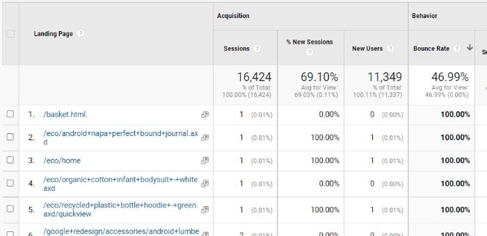
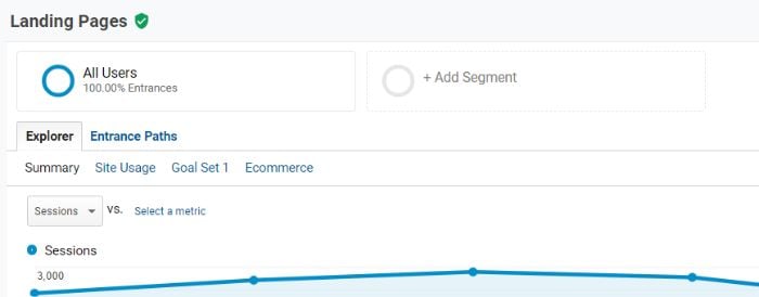
You’ll see a lot of the top pages have a very low number of sessions. To filter those out, we’re going to create a segment. Click “Add Segment” to the right of “All Users” at the top of the report.
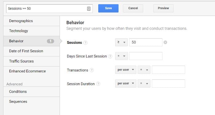
Click the red “+New Segment” button and then select “Behavior” from the left side options. Here, you can decide what pages to exclude by adding a quantity next to “Sessions.”
Click Save, and when you return to the report you’ll now see the bounce rate by two segments: All Users and the new sessions segment you just created.
Click the first webpage on the list. You’ll notice the Primary dimension above the chart changes to “Page path level 2.”
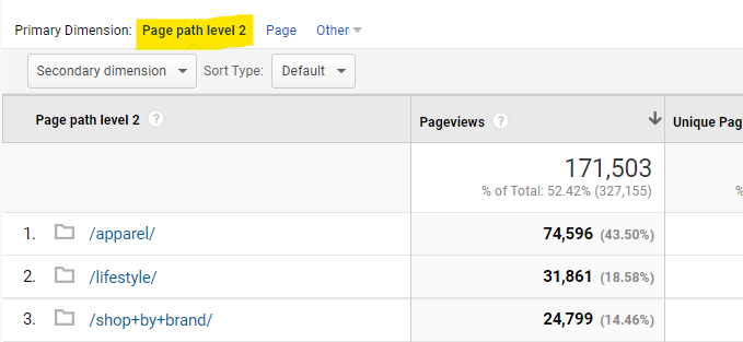
This is the breakdown of the pages the user went to after they bounced from the initial page. With this information, you can understand how users navigate your site as well as what may have been missing from the bounced page to bring them to the next one. This knowledge can help you improve the page content.
2. Use Content Marketing Analytics to Identify Content Gaps and Create New Content
Not only can analytics tell you what pages your users visit, but it can also tell you what content your visitors want but aren’t getting. What do I mean?
Content marketing analytics tools look at the user journey from how users get to your website to where and when they leave. The “how” part of that journey can tell you what users are searching for before they ultimately make it to your site.
This is a major concern for businesses of all kinds. Just consider that 66 percent of businesses want to increase their content creation spending, and it makes perfect sense.
Using Ubersuggest’s free keyword tool, you can see what search terms get the most traffic and the top pages that rank for those terms.

To identify content gaps, you can cross-reference these keywords with the page’s analytics. You’ll want to pay close attention to bounce rate, exit rate, and time spent on site.
What will this tell you?
Pages with consistent traffic but high bounce or exit rates aren’t meeting the needs of the visitor. With keyword research, though, you can determine what visitors are specifically looking for and add content that covers it.
3. Research What Terms Your Top Pages Rank for and Create Content for Related Terms
Speaking of how visitors get to your site, you can also reverse engineer your page rankings to see what terms your top pages rank for. With this information, you can then create content on related search terms.
With a tool like Google Search Console, it’s very easy to see what keywords each page on your website ranks for. Here’s how.
Note that the steps below assume you have a Google Search Console account with a verified web property.
Log in to Google Search Console and then go to “Performance” in the left navigation. Click “+ New” and select “Page” from the dropdown menu.
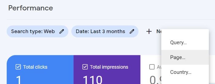
Here you can enter any URL on your website, including blog posts. Add the desired URL and click “Apply.” Now scroll down to Queries to see a list of top queries for that URL, including impressions and clicks.
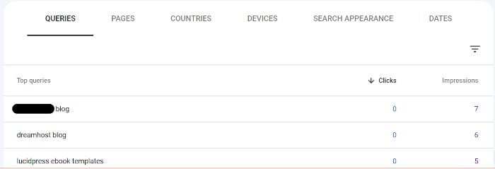
You don’t have to enter a specific URL, either. You can look at queries for your entire website, which could be a useful way to research if your website or blog is relatively small.
Using the data from above, you can then use a keyword research tool like Ubersuggest or Google Ads keyword planner to find related keywords that you’re not currently ranking for.
This helps decrease content gaps (like those discussed in the previous section), increase impressions, and increase clicks on your current URLs. With organic search driving 53.3 percent of content consumption, now is as good a time as any to take control over targeted keywords.
4. Compare Engagement Across Platforms to Determine Mobile-Friendliness and Implement Changes
Do you know how and on what devices your website’s visitors are using your website? If not, you may have a poorly optimized experience for a large number of your visitors. This not only drives traffic away but can also harm your overall brand strategy.
Worldwide internet traffic is broken down by device as follows:
- 56.05 percent mobile
- 41.52 percent desktop
- 2.43 percent tablet
The breakdown varies for each country, region, and website, but the fact remains that mobile devices are used by the majority of users on a regular basis.
How can you learn about your visitors’ platform habits? Google Analytics offers such content marketing insights!
Log in to your Google Analytics account. In the left navigation under “Reports,” go to Audience > Mobile > Overview.
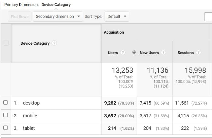
Here you can see device categories (i.e., desktop, mobile, and tablet) as broken down by acquisition, behavior, and conversion metrics.
For this step, you’ll want to focus on conversion metrics and how they compare across devices. What can these metrics tell you? Let’s say the desktop conversion rate is 2.73 percent, but the mobile conversion rate is only 0.89 percent. This tells you to investigate the mobile-friendliness of your website using tools such as those offered by Google or Bing.
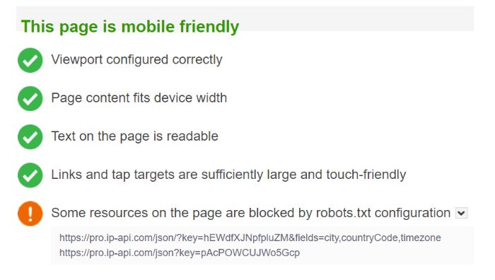
Even if your site is overall mobile-friendly, these tools can offer insights to help you make it even better.
5. Use Audience Data to Find High Traffic and High Bounce Groups to Identify Issues and Improve Experience
Bounce rates vary by website type and even by page type on individual websites. For example, the average bounce rate for a blog page is 82.4 percent.
While this is a helpful guideline, it can sometimes be more helpful to look at audience segment bounce rate instead of page type. If certain demographics have high traffic and high bounce rates, we can use that information to improve the experience.
There are a few reasons why you may see this traffic/bounce rate combination. Just a few examples include:
- your page ranking for an unrelated topic
- your page ranking for a closely related topic
- your page containing outdated or incorrect information
By focusing on audience segments with high traffic and high bounce rates, you can find those sorts of issues and more.
How can you identify these issues? Various audience segmentation tools like Kissmetrics, Adobe Analytics, or Google Analytics can help. Here’s how to narrow down audience segments in Google Analytics.
First, go to “Audience” in the left navigation. Here you can look at different audience breakdowns by Demographics, Interests, Behavior, and Technology. This is where you’ll initially pinpoint segments with high bounce rates.
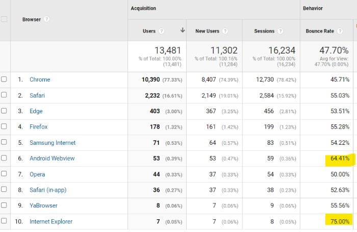
Once you have a list of audience segments with high bounce rates, you can play around with custom segments. At the top of any report, click “Add Segment.”

Here you can add a combination of demographics, technology, traffic sources, and more to get a more in-depth look at audience behavior. How can you make the most of this segmentation?
In the left navigation, go to Behavior > Site Content > All Pages. This report offers a breakdown of page performance metrics, including page views, average time on page, entrances, bounce rate, and exit rate.

Using your custom segment, you can now see which pages on your site are the most impacted by the traffic/bounce rate disconnect.
6. Utilize a Visual Conversion Funnel to Identify Areas of Fall Off and Increase Conversions
A conversion funnel is a visual representation of the stages of a user’s journey through your website.
This is helpful for understanding where users enter your site, how they interact and behave while on the site, and where and how users finally convert. It can also highlight particular areas of fall-off, which is important to decipher if you ever hope to get your conversion above the average rate of 2.35 percent.
You know that not all users will convert–whether that’s to sign up for a newsletter, share a post, or make a purchase. There are roadblocks to any user’s conversion, but some are more insurmountable than others. This is where the visual conversion funnel can come in handy.
There are plenty of paid sales funnel software tools like ClickFunnels, Leadpages, and Wishpond. If you’re looking for a free solution, though, look no further than Google Analytics.
With Google Analytics, you can create a custom funnel. These take time to build and time to collect data. In the meantime, you have the option to use pre-built funnels for quick results. To access the funnels, go to Conversions > Ecommerce. From this dropdown list, you can choose either “Shopping Behavior” or “Checkout Behavior.”
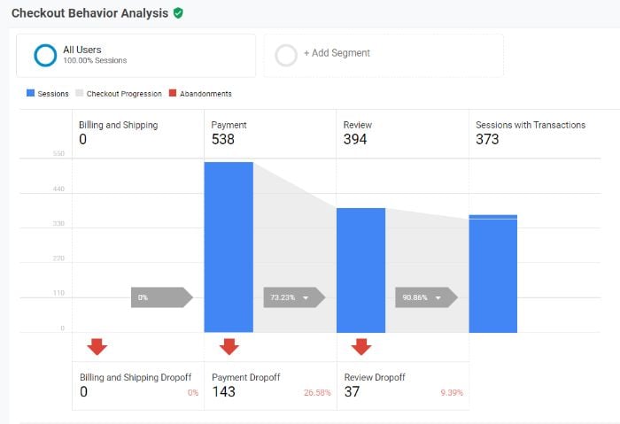
These funnels allow you to identify the exact step users are falling off your site or abandoning the checkout process. You can even use segmentationto target specific audiences for greater insight.
Once you have an understanding of which steps have the greatest fall-off, you can perform a full-funnel analysis to find ways to remove roadblocks and increase conversions.
7. Measure the Performance of Your Marketing Campaigns to Identify Wins, Losses, and Opportunities
The purpose of a marketing campaign is, typically, to attract new customers. As you create more campaigns, you should be using the results of past campaigns to guide your strategy. After all, segmented campaigns have been shown to increase revenue by as much as 760 percent.
Let’s start with Google’s Analytics’ Key Performance Indicator (KPI) dashboard.
Google Analytics allows you to create custom dashboards so you can see important KPIs all in one place. The KPIs may change for each campaign, but I can show you how to create your own custom dashboards and a few widgets to include.
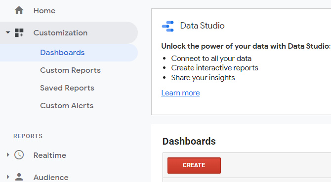
To do this, go to Customization > Dashboards in the left navigation. Then click the red “Create” button to start a new dashboard.
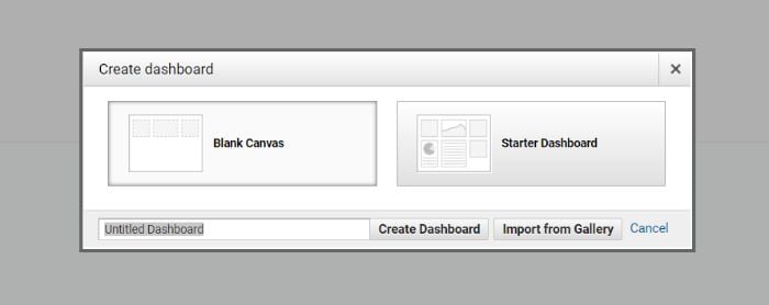
You can choose either “Blank Canvas” or “Starter Dashboard,” but I strongly recommend blank canvas for full customization capabilities.
Once you’ve clicked “Create Dashboard,” you’ll find there are dozens of widgets to use. These widgets can be customized with metrics, statistics, and graphs. While the KPIs will vary for each campaign dashboard, here are a few recommendations.
Traffic Source
This widget will tell you what traffic sources have the greatest impact on your campaign performance.
Select “Table” from the options and then set Source/Medium as your first metric.
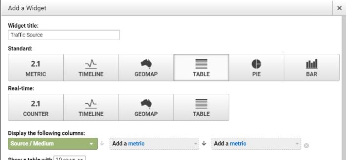
In the two remaining metrics dropdowns, you can select a few different options. Sessions and Revenue are two that make a lot of sense if you want a quick way to sort tangible results by traffic source. You can also select custom goals as a metric that’s often conversion-based.
Pageviews and Bounce Rate by Full Referrer
While sessions and pageviews can be helpful metrics, what matters more is the quality of those sessions and pageviews. This is why I like to look closely at visitor retention with the below widget.
Select “Table” again as an option in the widget creation tool. Then select the following three metrics: Full Referrer, Pageviews, and Bounce Rate.
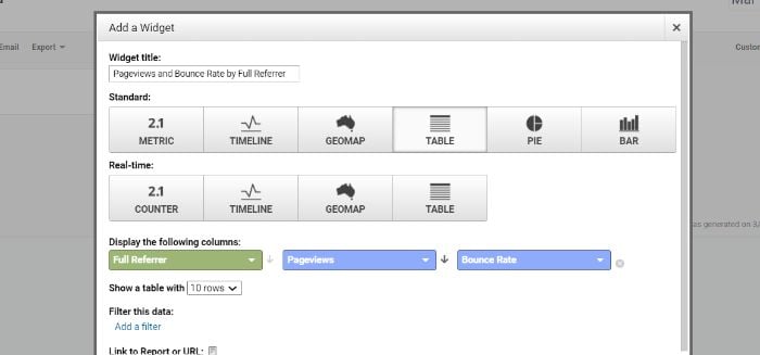
This widget will offer insight into the quality of the traffic you’re receiving from each referrer (e.g., direct traffic, Google search results, affiliate links, etc.). This will go a long way in helping you narrow in on your most successful campaign referrers so you can leverage that in the future.
8. Use Heat Maps to Understand How Visitors Use Your Website so You Can Improve Flow and User Experience
While tables, graphs, and flow charts can provide useful information, sometimes visual data can be more helpful. Heat maps come in handy, especially when understanding how visitors interact with the elements on your website.
Heat maps are visual representations of where users click on your webpage. They can also provide insight into how far users scroll, where they look, and where they hover their cursor. More advanced tools can even track eye movement. A study by Google and Carnegie Mellon found just a 64 percent correlation between mouse movement and eye movement. This means for the full picture, you should track both.
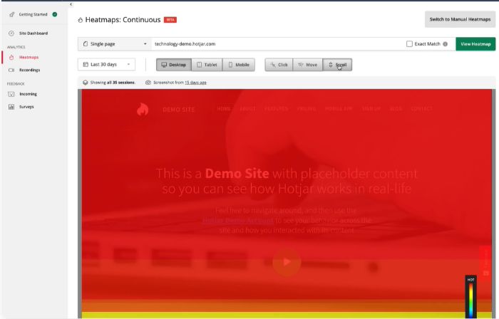
The obvious benefit of heat mapping is to improve user flow and user experience by removing roadblocks. How does this benefit your content strategy?
For one, a more user-friendly website will make it easier for visitors to navigate your blog content. This includes increasing click depth and the duration of time spent on the site.
However, you can also use it more directly to benefit your content creation process. For example, if you typically write 4,000-word blog posts, but users are only scrolling halfway through the post, this may indicate your audience is looking for shorter content. The same can be said for how users interact with hyperlinks, buttons, and content forms.
9. Understand Organic Search Metrics to Create Content Marketing Templates for Your Blog
If you’ve been blogging for any amount of time, you know there are numerous types of blog content:
- listicles
- how-to guides
- case studies
- infographics
- interviews
- cheatsheets
With so many content types to choose from, you may wonder which ones are right for your audience. The good news is that you don’t need to wonder.
By analyzing the performance of the content on your blog now, you can learn which types of content your audience prefers. You can then use this in future blog posts and campaigns.
In Google Analytics, go to Acquisition > All Traffic > Channels. We’re interested in organic traffic, so click “Direct.”
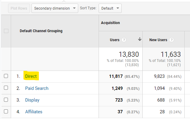
You’ll see a table that breaks down organic traffic by landing page. If your website has a URL structure that includes “blog” in the slug, you can search for that in the search bar of the table. If not, you’ll need to find the posts manually.
What are you looking for?
Content pages with low bounce rate and high session duration. This tells you that the organic traffic led to this page is liking the content they see. If it has a high number of sessions, it’s also telling you that search engines like this type of content (for the time being, anyway). It also likely means you’re ranking on the first page (and even more likely the top five) since the first five organic results account for more than two-thirds of all clicks.
You can use these results to 1) create content that your users interact with and 2) use content formatting similar to the higher traffic pages to continue to rank highly on search engine results Pages

